This week we were given two learning activities, one about positioning and one about understanding ideals.
We were given 3 tasks to help us to understand positioning, what it is and how it works.
1 – Look at the following logos and explain in your own words what you consider their positioning to be (do this for each one).


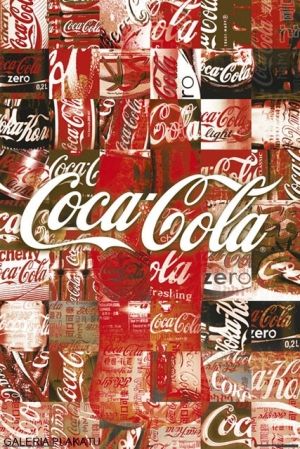
Coca-Cola:
Coca-cola is very strongly positioned, familiar around the globe and “always there”. They are accessible, smart and creative. They know their market and their customers, always in the game to give their customers what they want and need. The brand is so familiar and big, that I would have serious trouble with finding someone who has not heard of Coca-cola. They have a strong foundation, a long history, but they never rest on their laurels. They are innovative and always ready to work harder and do more.
Volkswagen:
A clear contender within the car industry. It has a familiar logo, a long history and a very trustworthy reputation. It is constantly on the marked, following the trends, always evolving and getting better. It is a brand of generations, always well represented. It represents a product that is well crafted, trustworthy and reliable.
Visa:

Visa is all about trust. They are always there, always accepted and safe. The world really does take visa, and this makes it THE brand to be connected to. They have a very clear and concise place and position, and are always accepted.
2 – Lets work backwards! Look at the logo on the Apple iPhone and, by doing your own research, investigate the history of the product and the company that manufactures it. Give an outline, in your own words, of what you consider the following to be:
Describe its brand identity – exactly as you see it
Sleek, new-thinking, innovation,modern,ground breaking, easy, best in technology, strong contender communication.
What do you think its positioning is currently?
A big contender in communications and technology, very smart and clever. Focus on quality, exclusive and stylish. Always in the game, and often one step ahead. Very clear goals, and a giant in the business.
What do you think the strategy for this specific product was?
One device for all lines of communication and social media. Everything in one place, one gadget to cover all your needs. Phone, text, photos, social media. It was to be smart and easy to use, and to give the feel of something exclusive.
What research do you think was done on this by the company who made it?

3 – Now take the same product as in question 2 and explain, in your own words, how the visual element (in this case, the logo) fits in with the brand identity.
It is very sleek, smart and clever just like the product. It does not take up too much space but is at the same time represented in a very nice way. It goes well with the colours and look of the device, only represented in one colour and not at all cluttered in any way. It is easy to recognise, and fits very well with the brand identity of Apple and their position in the technology market.


