The second part of this week’s learning activities was to help us understand Ideals.
Visit a well-known retail outlet, like an Apple, Nike, Levi, H&M or Ikea store. (The brand must be well-known and you must visit a shop where their products are being displayed or distributed). Before going to the shop, determine the following about their brand identity and, once at the shop, evaluate how they remain true to their brand identity or not. How is the brand identity enhanced (or, perhaps, not expressed) at the point of customer interaction?
I chose to visit and H&M store, as it is a retail outlet I know well, but one that I have never really thought much about in terms of ideals and positioning etc.

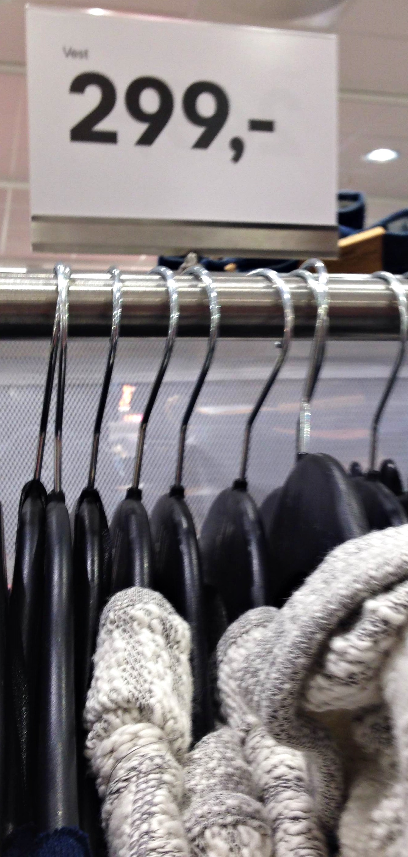
The way I see H&M’s brand identity is that it offers current fashion and high-end styles, at low costs and good value. They follow the trends and creates a great market for the less wealthy fashionista. They always represent their goods in a consistent way, always sporting the same fonts, using the common colours of red, white and black. Their logo is always very visible in the stores and on all products. Every sales poster has the logo, the correct colours and the same font.
There are new products coming in several times a week, which allows one to get a hold of items of clothing that might not be available (sold out) by the next week. Some products are made for all-year around, and can always be found in all stores, while they also offer products that are only short-term and limited edition.
Customer interaction is swift and easy, always.
What brand identity element are they using in their logo (e.g. abstract mark or word mark)?
The logo is very simple, containing only three characters: H, &, and M. H & M stands for the actual name of the company/brand, Hennes and Mauritz. The logo can be found either in red or black (depending on what it is used for, posters/catalogue/store front/signage), and has a very specific and easily recognizable font.

What do you think their brand ideal is?How do they remain true to their brand ideal within their shops?
I believe that H&M’s brand ideal is to always be able to offer fashion forward clothes and accessories for a good value/low price.
When you walk in to an H&M store it is obvious that there are many products to choose from, offering clothes for men, women and children, but also divided in to sub-categories such as lingerie, night-time wear and sports clothing. There are also several brands within the product line such as a special line aimed at teenagers and a special line aimed to be more sustainable and “earthy”. You are always able to find a variety of styles and many products similar to the ones just seen on runways around the globe.
The logo is well-represented within the store, and on all posters and signage within the store you see the same colours and fonts used over and over.
H&M is simple, easy accessible, and you are always be able to find a good product at great value. Staying true to their logo, font, and colour use makes it a familiar brand, easy to recognize, and clever signage use draws attention to especially great offers and prices.

Evaluate the customer experience according to the brand ideal. (For example, if the brand ideal is “innovation”, do you get a sense of that ideal when you visit the outlet?)
Whenever I walk in to H&M I know that I will be able to find whatever I need, and that it will not create a big dent in your wallet. I will get a lot of value for my money, and the use of signage in store allows me to easily navigate in the store, and also find good products at a nice price. The fact that I instantly recognise the posters and signage due to the use of the same fonts and colours is also a big plus. consistency and familiarity are two things that will make me want to come back again.

Evaluate the visual display of the products according to the brand ideal. (For example, if the brand ideal is “value”, is this expressed in the way they display the products?)
The visual display of the products do fit well with the brand ideal. There is a lot to offer but the product placement allows one to quickly recognize what can be found where, and the products are also colour coordinated. The stores are divided in to sections according to the “sub-brands”, and it is easy to recognize the different sections by the products on display. Signage shows certain products that are of especially high value and/or low price. All these things work together to show the large selection, the best prices and the highest value items.